UX
Visual Design
Prototyping
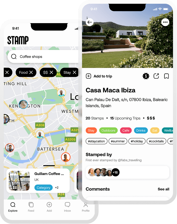
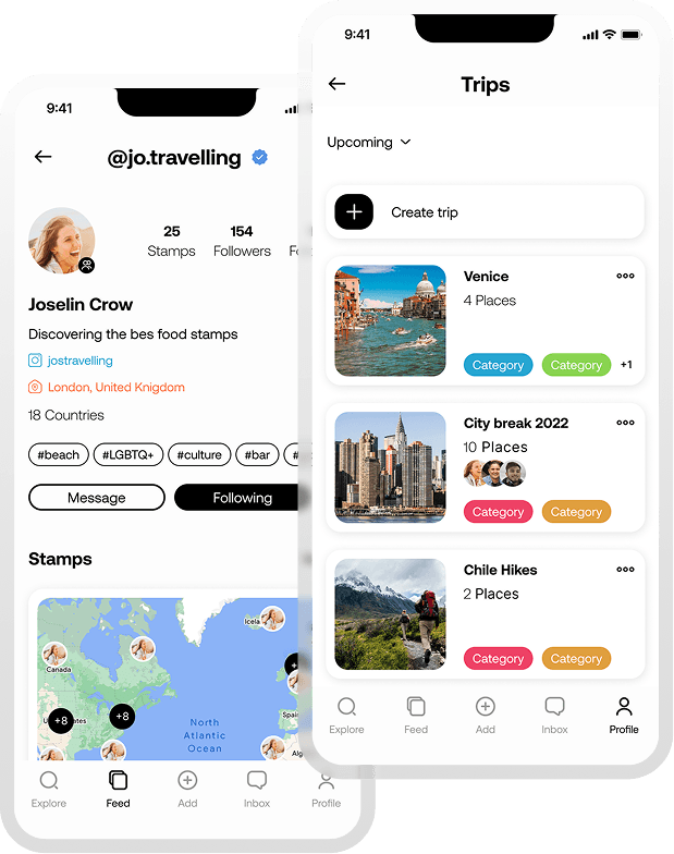
Mobile App
Three visual directions. One shared vision. Every screen designed to feel like a recommendation from a friend.


Travel recommendation platforms were cluttered, impersonal and driven by strangers. There was a gap for something that felt more like a friend's tip than a review site, intimate, visual and good-vibes only.
The standard: WCAG 2.2 sets the benchmark for accessible digital experiences. Every finding was assessed against its criteria, ensuring recommendations were grounded in recognised guidelines rather than opinion, giving Toyota's team the confidence to act on them.

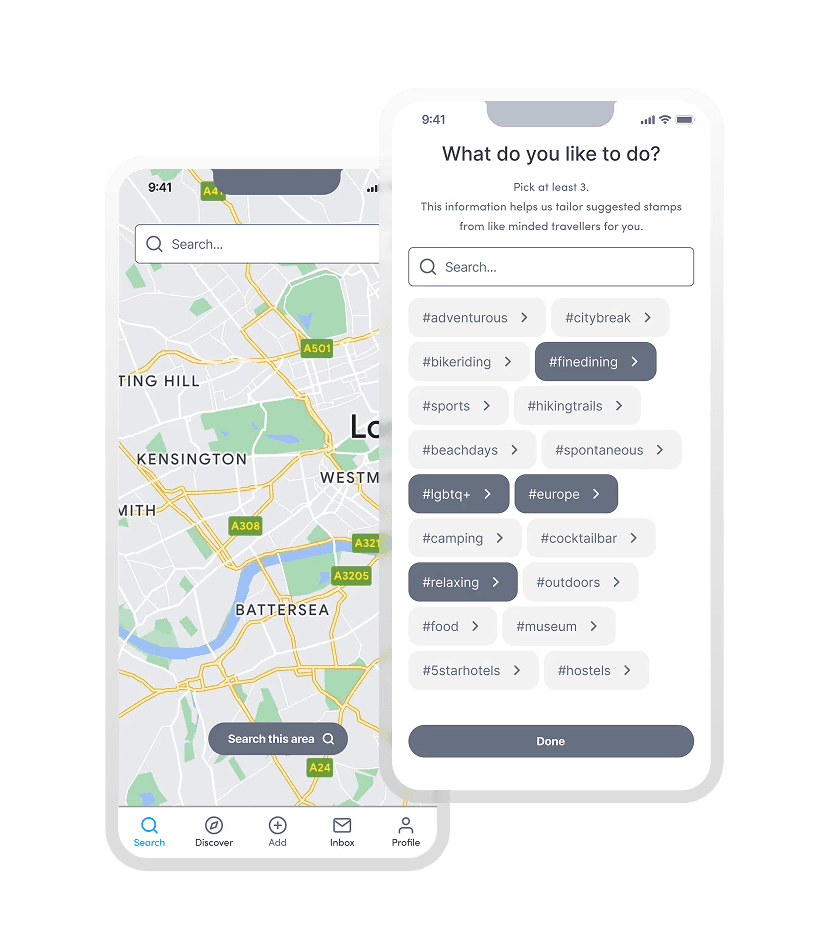
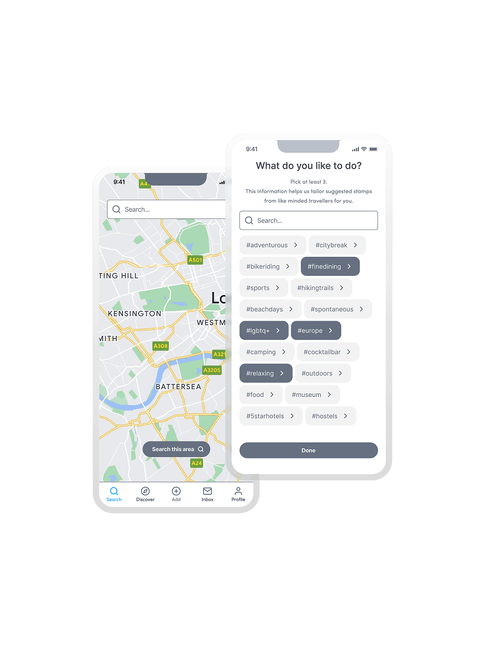

A fully designed and handed-over iOS MVP, delivered from sprint to development across a full end-to-end engagement.
4
3
Biffa_Sectorless

Project_Name